ASK THE EXPERT
Ernesto Toxqui Damian has 5 years experience with PMA and is a certified eBuilder Partner with a software engineering background. He is a proven software developer, business analyst, and project manager with hands-on experience with Java, Javascript, SQL, VBA, and Business Intelligence tools.
We sat down with Ernesto to discuss Microsoft Power BI and dashboards for a wide variety of projects. In this second part of our conversation, Ernesto addresses KPIs and recounts his experience with a project integrating many diverse sources of data analysis into Power BI.
What is a KPI in construction?
In general, a KPI is a Key Performance Indicator. Specifically, KPIs in construction are particular to that industry. As it is defined, we are working with two different types of practices. One we call best practices. That is what, in general, the industries or that specific industry work with. In my experience, best practices say what we have in terms of value. We have SPIs—Score Performance Indicators—or we can have performance indicators. And with a specific name, they also provide the definition.
The other metric is the specific KPIs or specific practices of a company. For example, a KPI could be an enviro-metric to know the cost performance indicator. Am I doing well? Then the ‘I’m doing well’ could be deliverables: Am I receiving the sheets ordered at a specific time?
Also, within a week of milestones in our schedule, we could ask: are we meeting those milestones on time? I may have a specific number of people that I’m working with. Am I using those people, and are they completing the work that they were assigned to do? Possibly I can complete the work with fewer people. It could be that I complete the work with more people, as in resource leveling.
These examples could be general standard rules. On the other hand, sometimes specific companies have their own company-defined rules, even specific technical jargon.
Some companies say, ‘I’m going to create my indicators because they’re important for me’. But, because they’re essential to compare against what I’m doing, I indicate the name VOWD—value worked on. They have a specific definition of why they use this name and those initials.

Tell me why it’s crucial to build a KPI dashboard.
The KPI is a compass that allows you to check and measure the project’s health, progress, and status. First of all, even when the credit goes to Power BI, a lot of work must be done beforehand, in the back end, in the company. The decision-maker that uses it must understand what every KPI means. Otherwise, we are presenting information; metrics; the results of formulas that nobody understands, and nobody knows what they are.
These inputs could be rolled up, put together into a formula, and presented in a dashboard that allows anyone to check if things are correct and the health of the project. For example, if I know that somebody is late in payment or the work is done already, but it’s late in payment, there will be a metric about accounts payable: how frequently or how many days after the work is complete; how many days after the work is paid, the invoice is paid, etc.
Another point could be in my schedule: Am I focusing on critical activities? How many critical activities did I have before? How many critical activities do I have now? My project is based on a critical path that used to be one year, 365 days.
Suddenly, the next month I can see in my metric that the number of days is now 400. So, what happened? When we cut these kinds of metrics about calculating critical path, calculating the cost, calculating a comparison, or a trend in a month, this allows me to check if I’m managing it correctly, if the project is performing appropriately, or if it is something to which I have to pay attention.
Can you describe the use of Power BI on a project that you have worked on?
The project I’m going to share is when a client specifically wanted to have a passport with multiple areas or many areas in project management. The typical cost on a schedule, risk, and a log of issues about which you may ask, well, what is additional, or the relevance of this?
First, the client wanted to reduce human interaction to a minimum. Obviously, during the development, this is almost impossible. We develop it, so we need to interact. But once it’s up and running, the intention is that with a click of a button (not even a click of a button!), we can reschedule that information at specific times. Like every four hours, or like every day, like at night, or a specific time frame, the information is refreshed to be self-fed with the most recent information automatically. The other complexity was that the information comes from multiple systems, and the main one is PCX.
For those who have worked with PCX, we know that there are different flavors. There is PCX when we are working in standalone—basically, my computer. There is another version of PCX that can be in the cloud. There’s yet another version of PCX for companies when we manage a lot of records and many projects. Here the database is Oracle which can handle a significant amount of records.
On top of that, the client had security. To connect, you need to have VPN, and you have to cover specific drivers and database drivers to achieve the connection. To achieve that, it also requires multiple teams. One team responsible for the company is the administrator of the PCX application.
We also had the network administrator. The network administrator eventually permitted us to have a VPN so we could have access to the information. Then, we had the administrators and the database administrators, or Oracle administrators. So, organizing ourselves was a daunting task.
When we opened a ticket that needed information, we needed access to that system. The first complexity was trying to identify who was responsible, trying to put all these teams together, which would have been great from the beginning. You are the link to different layers and different responsibilities, which we learned down the road.
Eventually, we had access, and we had the experience to work and write the Microsoft SQL Server schedules. The theory says that if you write something in a SQL statement, it is a standard. You can transfer the SQL information from Access to a Microsoft SQL Server to Oracle and Oracle database and SQL.
But, in practice, those standards are met only by a specific percentage: say, 90%, maybe 95% (as a guess). Eventually, we have all this information written in other queries in other environments because we continue the work. Still, we need to put it together in the real environment, in production with the client. And when we did that, it was not working. We needed to re-test; we needed to re-do the work.
The other complexity was in the multiple versions of PCX. All that information, in theory, is recorded in the database. But, voila! We found out that you have a schedule when it comes to time-faced information, and it goes from one start date to one finish date. And that start to finish could be within a year. When we have a cost, and that cost is spread across the year, we use curves.
Well, it happens that the information of the curves is recorded in a specific format that is not standard. Not even within Oracle is it a standard format; it is not XML; it is not Jason; it is what it is. And even the records are different. This situation created a significant challenge in using Power BI to its fullest potential. Do we use any M query, docs functions, whatever tool, whatever idea we had to implement and deploy this dashboard successfully?
I was fortunate to work with very skillful people in PMA so that, as a team, we managed to pull it together and be successful with implementation.
What issues were identified that would have been missed with the use of a Power BI?
I think when we are working on a project, there’s a very objective area. For example, we work with metrics and KPIs because they are formulas that we have to comply with and represent. The representation can be visual, a graph; but eventually, the calculation behind it is a number, a formula.
Sometimes an issue arises from things that are not that objective. For example, there are subjective perceptions that could come even when you are finishing the dashboard you presented. It could arise from thinking that there are different ways to present the same information. For example, I could be using conditional formatting and represent a known by putting it in red if it is not good, or in green, if it is good, and have a traffic light kind of representation on this same principle; green for good, yellow for so-so, and red for something else.
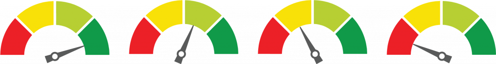
But we can also use gauges like the arrow, which can say this is good within a threshold. There are multiple ways to represent information and present it in reports and dashboards. This is an advantage, but sometimes it poses a challenge when working with a client as we present something because of differing perceptions.
When we are working on projects, from the very beginning, we create a quote. We estimate how many hours until we are going to finish, how long it will take us to complete, how many resources, and so on. These are “little things” and can expand and roll up and eventually consume a significant amount of time and cost if they are not cared for. The other aspect is, as I mentioned, the objective ones; they may sometimes be complex.
I’ve faced complex relationships between one set of data and another because the format and data sources are different. But at least we have a compass, and that compass is that the numbers and the formula should be there. Eventually, we know the numbers were not calculating correctly from the very beginning. We know that something is wrong, and we have to fix it. It’s visible for me as a developer to know that something is wrong. However, with colors, with interpretation, with subjectivity, it’s a different story. To my eyes, it could be good, but to the eyes of the beholder, beauty can be different.
How did Power BI impact the project?
Power BI, as an aide, helps to avoid significant impacts on a project by being visible and providing data visualizations. It allows the project managers and every person who needs to know the information to see the progress of that specific project. Making that information visible allows you to check; it allows you to reap the benefits of transparency. And if something is not going correctly, this will catch your eye so you can immediately raise your hand and ask. I think Power BI is an excellent tool that allows the project to avoid significant adverse impacts.